Thursday, 11 July 2013

Thing 23: Summing up

Flickr CC image by Nana B Agyei - view the original at
http://www.flickr.com/photos/32876353@N04/8330945843

Okay, we've reached the end. Thank you to anyone who took part (the list of signed up bloggers is here, but thank you also to those who dipped in and out and tried out some Things) - I really hope some of it was useful and you'll continue to use 1 or more of these tools in the future. You can revisit the full list of Things at any time if you need a reminder or missed any out.

Huge congratulations to the winner of the best 23 Things blog award! There was a panel of judges across IT and the Library and we found picking a winner very hard - in the end there were four outstanding blogs that we thought deserved some recognition. In joint 3rd place (winning a small Amazon voucher each) were Rodge Butler-Ellis and Penelope Dunn - you can read Rodge's blog here, and Penelope's blog here. In second place (with a bigger Amazon voucher) was Ruth McMullen - read Ruth's blog here.

And the winner (with a really quite large Amazon voucher) was Maria Nagle. The blog was a really engaging read, there's plenty of ideas there to follow-up on, and it looks like it'll hopefully develop into a really interesting blog generally, now that 23 Things if finished. Check out Maria's efforts here.

A great many 23 Things blogs go on to just become normal blogs in the future, so if you've started blogging, don't stop now...

Wednesday, 10 July 2013

Thing 22: Google Hangouts

The great thing about cloud applications is that they undergo incremental development - no waiting years for the next release. The annoying thing about cloud applications is that they undergo incremental development - no waiting years for the next release - but you may wake up one morning to find it's all changed.
Such was the case with New Hangouts, its release timed to perfection a few days before it was destined to become one of our 'Things'. So finally...

When I were a lad (quite a while ago now), many futuristic TV programmes included people talking to each other using some kind of visual communication system - video screens on the wall or a hand-held device. They also tended to include some rather dodgy fashion statements, but that's another issue.

The point is we've been expecting it for years, and now we can all join Jeff Tracy and his sons, together with Lady Penelope Creighton-Ward, and talk 'face to face' when we're miles apart.
Actually, we've been using video-conferencing and Skype for ages now, but a Google Hangout makes it really easy, AND you can broadcast it if you need.

What's a Google Hangout?

It was a component of Google+ (G+) (see Thing 8) with which you can hold a video conversation with one or more people simultaneously, but the new version integrates better with email calendar etc. Although Google maintain you don't need a Google+ profile to use Hangouts, in practice you do if you want to start/join group video calls or use it with iOS devices. If you don't already have a Google+ profile, take another look at Thing 8.

You can get into a hangout through several routes, but when you get there it will basically look the same. In the example shown here, Larry Lamb and Sean the Sheep are enjoying a video chat.


During a Hangout you can:
  • Invite more people 
  • Choose who to view (also auto-selects person talking)
  • Mute microphone and/or camera
  • 'Chat' silently with typed text
  • Share screens
  • Capture the screen image
  • Share and edit Google documents
  • Wear silly hats - via the icon below drive documents (optional)

Why should I Hangout?

Interesting question, suggesting some US companies need to think more carefully how they name products and services. Have I ever told you my (true) story about the re-branding of the 'Customer Care' section of the 'Wang' computer company? I digress.
  • It's a simple conference call, where you don't have to book special rooms or equipment
  • You can have a face-to-face conversation with people - an alternative to a voice-only phone call
  • Great for meetings when people are in lots of different places
  • You can have a meeting without getting out of bed (not recommended)
  • Friendlier contact with distance learners
  • Broadcast an interactive lecture that can be viewed later
  • Screen-sharing feature lets you 'show what you mean' when it's difficult to describe
The list could go on...

What do I need?

  • a computer with a web camera and microphone - most laptops are now equipped with these. It works fine with a PC, Mac, Chromebook and probably several others I haven't tried. With an iPad you need to download the (Free) G+ App.
  • a reasonably good network connection - it will usually work on the UoY Wi-Fi.
  • a G+ account - see Thing 8 if you need to know how to sign up for G+
... and that's it.

How do I start a Hangout?


Since the recent changes, starting and joining a hangout has become even easier as it now integrates more closely with email chat and calendar. Look for:

Google+

On G+, over on the right, is the new 'green with quotes' Hangout icon. Choosing it reveals a list of the people with whom you've already 'hung out'. Start a Hangout using any of these methods:
  • Click the + next to New Hangout and enter an email address
  • Hover over a person from a previous Hangout and choose the Hangout icon at the bottom of their profile pop-up - then choose the camera icon to initiate contact
  • At the foot of the Hangouts pane, hover over Hangout Party and choose Start a Party (yes, I know). Invite people using email addresses - you can also invite G+ circles

Another method:
  • From your G+ page, under the Share what's new... box choose Hangout

Email chat

  1. Open the chat section of the mail screen (speech bubble, bottom left - unless you've moved it).
  2. Make sure you are signed in to chat - you and others with cameras are listed with a camera icon instead of a simple green disc (though this isn't 100% reliable).
  3. You can then initiate a Hangout with an individual on your list or start a hangout and invite several people using various methods - watch for pop-up boxes, chat boxes etc and look for the icons.

Calendar Hangouts

This lets you plan a hangout at the same time as you invite people to a calendar event.
  1. Set up an event in calendar as normal, but make sure you choose Edit Event to see the full details. Invite people as normal.
  2. Before you Save, choose the Add Google+ Hangout link - it's labelled Video call and is below the Where textbox.
  3. It's also a good idea to make sure you set a reminder or you may leave people hanging around for you when they should be hanging out with you.
  4. When the appointment time arrives, view the appointment and choose the link next to Video call - this should take you direct to the Hangout. It doesn't matter who joins first.

Hangouts on Air

You can also choose to do a Hangout on Air. This means it is 'broadcast' (streamed) as it happens and others can view it. The session is also recorded and stored on YouTube (see Thing 21), which means you can provide others with a link to the recording after the session has finished.  Some at the University are making great use of this to do 'broadcast' lectures, so their students don't need to get out of bed (humour).
(this is a screen shot of a publicly shared Google in Education Hangout on Air)

You can initiate a Hangout on Air:
  • From G+ - point at the Home icon and choose it on the list, then select Start a Hangout On Air
  • If you have a YouTube account, visit your YouTube home page and choose Upload - you'll see Hangouts On Air listed under Create videos.

Activity

Camera Safety - There have been some recently publicised cases of laptop cameras being hacked, allowing the hacker to access the view from the camera. This is unlikely to be a problem if you have proper protection (anti-virus software etc), but it's worth being aware of this possibility. On many computers a small light shows the camera is on and can warn of unexpected activity, but in any case you should avoid hangouts whilst showering.

 Now it's your turn, but you'll need a friendly colleague to try this with, and you'll both need access to a computer with a web camera and microphone. The best way to get the hang of Hangouts is to try hanging out and experimenting with the features - 30mins to 1hr should be enough for starters.
  1. Start by finding a friendly, suitably-equipped colleague (who doesn't need to be in the same room but it can be easier to start with if you can do real talk with each other).
  2. Make sure both of you have your G+ page open (and get them to agree to respond to you!).
  3. Start a hangout from G+ and invite them to it using their email address.
  4. If you can find another friendly, suitably-equipped colleague, invite them too. It's more fun with three.
  5. Try other features, like screenshare and silly hats.
  6. Hangup this Hangout and initiate one with your well-equipped colleague via the chat feature of Google mail - make sure you're signed in to chat.
  7. See if you can create and edit a Google document between you.
  8. Hangup again and in your calendar create an event about 15 minutes in the future. Invite your suitably-equipped colleague(s) and also select the Add video call link (just beneath Where), making sure a reminder is set, and Save the event.
    You should find that when you click on the event, the pop-up includes a link to Join video call. When the appointed time arrives (the reminder says it's a video call), join using this method (and encourage your colleague(s) to do the same or you'll end up taking to yourself - I do that all the time (who? me? Yes, you!))
  9. Practice regularly, and if you have access to other devices (iPad users pay attention), you might like to try it with those too. In many cases you'll need to download an App to get it working.
  10. ...and when you've experienced some interesting hangouts, write about it in your Blog.

Monday, 8 July 2013

Thing 21: YouTube and online video

Video has become a hugely important part of the web - people increasingly learn by watching film rather than reading instructions. YouTube is the second most popular search engine after Google - more people run searches on there for videos each day, than run searches for EVERYTHING on Bing, Yahoo, and all the rest.

There's a million and one things we could write about this topic, but I want to keep this brief. If you want more info on how to create video here's a column I wrote on this topic for Library Journal; we're going to focus on YouTube here but if you want to read a comparison between YouTube and Vimeo, the other big video sharing site, I've written one here.

Image via IconFinder
http://www.iconfinder.com/icondetails/60234/256/youtube_icon


YouTube: what is it? 


YouTube is the biggest video sharing site on the net, and one of the most popular and used sites of any kind. Some stats:

  • More than 1 billion unique users visit YouTube each month
  • Over 6 billion hours of video are watched each month on YouTube – that's almost an hour for every person on Earth, and 50% more than last year
  • 100 hours of video are uploaded to YouTube every minute

That's just the tip of the iceberg, really - you can find lots more on YouTube's own stats page.

Why use it?


YouTube is great for distributing information. The Directorate's YouTube channel can be found here - www.youtube.com/user/YorkInformation. Our most popular video (the virtual tour of the Library) has over 3,000 views and in total people have watched over thirteen thousand minutes of our videos! It's hard to imagine any other way to reach that number of people with that amount of information.

But it's also great for finding information. YouTube is full of videos of cats being cute and people falling over, to be sure, but it's also got a load of really useful, legitimate and relevant content to. You don't have to be a creator of videos to find things on the site which can help you professionally.

Activity: find and share a useful video 


Obviously we can't set an activity of creating a video, as that would take technical expertise, equipment resources, and a massive amount of time. So the activity for this Thing, which should take 5 to 10 minutes, is just to go to youtube.com and find a video which is useful to you professionally. So in other words search YouTube for something relevant to working in IT, libraries or archives, or about social media and Web 2.0 tools. Then either post a link to it on your 23 Things blog (embed it if you know how!), post it to the Padlet Wall from the previous post, Tweet it if you're on Twitter.

Wednesday, 3 July 2013

Thing 20: Padlet: paper for the web

Padlet, formerly known as Wallwisher, describes itself as paper for the web. It has a few useful applications for both organisations and individuals.

What is it?


On Padlet.com you can create a blank 'wall' with a title and a unique web address, then double click anywhere to add a sort of virtual post-it note to the wall. This post-it note can consist of text, or you can add links to images and videos which then appear embedded on your wall. You can either use it yourself or you can use it collaboratively with anyone else you share the link with.

Think of it as a virtual notice board, or a virtual white board, or whatever you want to do with it.

Why use it?


Padlet is really, really easy to use - anyone can double click on a screen, as long as they know how a mouse works. It updates instantly, do you never need to reload the page - if you were looking at a Padlet wall now and I added a note and started typing, you'd see it appearing. Mutimedia appears instantly without users having to know how HTML code works. And you can set the privacy level to whatever you want - so you could create a Wall and share it with just Directorate staff, or you could open it up to everyone.

Here are three examples of nice uses for Padlet. The first is from a training session I did for the PGCAP that all new academics at York have to go through: at the start of the session I asked each person who they were and what they wanted out of the next hour and a half. As they answered I wrote their answers down on a Padlet Wall, in the positions they were in round the table. This meant that A: I could document what they wanted out of the session, B: we could revisit it at the end to see if we did what people wanted and C: I could see who was sitting where for the rest of the session without having to remember all their names. The Wall looked like this:


(This is actually a pretty bad example of this use for Padlet as none of the academics could really even remember why they signed up, let alone what they wanted out of the session, but you get the principle.)

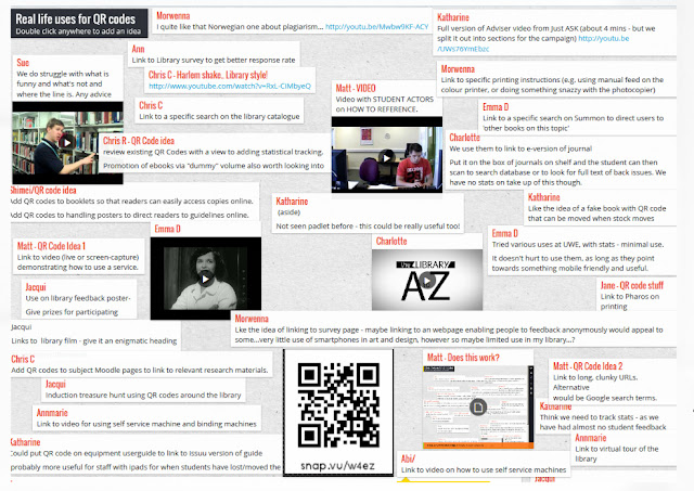
Another use for Padlet is to get delegates in a training session to post thoughts, or examples, or ideas, or favourite links, to a Wall that you create and give them all the URL for. Here's an example from another training session - I spoke about QR Codes for a bit and then got the participants to write down some real life examples of what they could actually DO with QR Codes in real life (rather than just thinking about them in the abstract). Because they all had the URL they could all see each others' ideas, and refer back to the Wall later too.

The third example (I can't show you a Wall because I've not done it) would be to use Padlet for feedback - when introducing a new service in the Library, IT or Archives, for example, or asking for suggestions on new services, or anything at all - you can set up a Wall, give people the link, and ask them to post their feedback just like you would with physical post-it notes. As the creator of the Wall you can moderate the contents, so any offending post-its could be deleted!

Activity: post on my wall! 


A really simple activity this one, it should only take a couple of minutes. Go to the Wall I've set up for 23 Things at padlet.com/wall/23thingsyorkdemo  and post something. That's it!

If you think Padlet might be useful to you or your service, why not sign up for an account and have a play around.

Monday, 1 July 2013

Thing 19: Using Prezi to create zooming presentations

(NB: I've taken as the basis for this article the guide to Prezi I wrote for the LSE Impact Blog.)

Prezi.com is a zooming presentation tool which offers an alternative to PowerPoint. As it grows in popularity it is being seen more and more often across campuses, and the quality of these presentations is variable; when used well Prezi can be a fabulous communication tool, but when used badly it can leave the audience feeling bamboozled, and potentially slightly sea-sick... We already use it a fair amount on the Library side of things, particularly in Induction - here's an example of a popular Library Prezi:


 You can see all of the Information Directorate Prezis here. So far we only have Library stuff on there and it would be good to add to it - regardless of what section you're from if you want the details of our Prezi account, please let me know (email me at ned.potter).

Basic principles of Prezi

With Prezi you begin with a blank canvas (or with any of the potentially very useful templates Prezi provides). You position objects such as text, images, embedded videos or graphics, anywhere you like on the canvas. You then plot a path between them in the order you specify, so Prezi zooms in on each object in turn, allowing you to deliver the presentation to the audience.

Strengths

  • Prezi is fresh and different. People sit up and take notice when they realise they aren't about to be faced with the usual Death by PowerPoint.
  • It can be completely non-linear. You can ignore the path you plot entirely and just click on objects to zoom in on (allowing for audience-led presentations), or change the path for every presentation depending on your audience and time-slot.
  • PowerPoint forces a hierarchy of information on you, whereas you dictate the hierarchy to Prezi - the most important points can be huge on the canvas, with the smaller points literally nestled inside them, for example. When not forced to present your ideas in an endless line of identical slide-shaped chunks, you can actually reconceptualise your ideas and think about things in a new way.
  • Prezi works better than a slide-deck does when you aren't there to talk over the top of it. You can easily embed a Prezi on any website or blog, or just direct people towards the presentation on Prezi.com itself - in either case it becomes a more dynamic online learning object than a set of slides. The audience can navigate straight to the information most relevant for them.

Weaknesses

  • When used badly, the zooming and lurching nature of Prezi makes the audience feel motion-sickness. This happens a LOT - it is up to the presenter to ensure this doesn't happen (see the Tips section below)
  • Prezi isn't brilliant for accessibility. A transcript is automatically provided, but it's not structured very helpfully - and screen-readers can't read Prezis. Matt Cornock in SPSW suggests a 'gold standard' of using Prezi for the face-to-face presentation but providing the information in an alternative format online afterwards, as well as linking to the Prezi itself.
  • Prezi requires flash (unless you save your presentation to a USB stick)
  • Prezi is so very different from the Microsoft Office suite we've become used to, that there is a learning curve on getting up to speed with using it effectively.
  • Prezi is so whizzy and capable of tricks and flashy moves, that sometimes people become lost in the technology and the medium becomes (or obscures) the message.

Examples

For space reasons we won't embed them all here, but here are some links.

Tips

  • Coherence matters. Most Prezis are just a load of objects placed randomly on the canvas, linked to in some semblance of order. However it's much more effective if you have a planned structure (perhaps sketched out roughly on a sheet of paper beforehand) that works in a logical and relevant way.
  • Use the top-down, full-screen view. You can zoom out at any time to show your whole presentation at once. Prezi was originally invented with this in mind - it allows you to show your audience exactly where you are in the presentation, where you've been, and where you're going, as you move along. This anchors the audience and helps them get the key messages you want to deliver. The other way to use the top down view is for a big reveal at the very end - perhaps the entire presentation has been a visual metaphor that perfectly illustrates your conclusion...
  • Take responsibility for the motion-sickness. As the presenter, it's your job to stop the audience feeling sick as your presentation zooms around. You can achieve this in various ways. Firstly, pace your Prezi sensibly - as you would a slide-deck - rather than whizzing from point to point every 5 seconds. Secondly, position your materials sympathetically rather than at random - in other words, work from left-to-right, or top-to-bottom, or anything that resembles a method of information delivery the brain is used to seeing. Thirdly, and perhaps most importantly, just because Prezi can rotate, barrel-roll, and spin about, doesn't mean you should! The best presentations I've seen on Prezi only use about 20% of Prezi's capabilities for most of the time, and have one or two special moments (going upside down, or an extreme zoon-in) to illustrate a key point.
  • Choose your visual theme early. Prezi isn't like PowerPoint where every slide can be different - you choose your theme (fonts, colours and shapes) and stick to it. It's best to do this at the start, in case changing the fonts later ruins your perfectly positioned pieces of text, for example.
  • Sign up with your .ac.uk (or .edu) email address. Academic users of Prezi get to upgrade to the Educational Licence for free, providing they sign up with an academic email address. This is well worth doing, as it gives you more storage space and the opportunity to set Prezis to 'private', ensuring no one finds them online until the presentation is finished

Activity 

Go to prezi.com and sign up, and try creating a very basic presentation using one of the templates provided - just so you can experience how it works. I can't really guess a time-span for this one - it's up to you how much you get into it! 

Further guidance

Finally, there are lots more tips and a whole lot of help in this guide to Prezi I created in Prezi itself - but if you have any questions this doesn't answer, leave them in a comment and I'll endeavor to reply. When used badly, Prezi interferes with what you're trying to say and leaves the audience feeling queasy. When used well, it delivers information in a fresh and arresting way which increases its impact. It's not appropriate for all situations, but you may find it a really useful tool in some circumstances - have a try, and see what you think.

Wednesday, 26 June 2013

Thing 18: Hosting presentations on Slideshare

Slideshare is the great underrated social media tool. It hosts PowerPoint presentation in the same way that YouTube hosts videos and Scribd hosts PDFs - and it exposes your presentations to a potentially MASSIVE audience.

What is it?


Slideshare.net is a mixture of a content hosting site (people upload their presentations there as a way of storing them online), a content sharing site (people will give the link to the Slideshare version of their presentation after a conference talk or workshop so delegates can refer back to it) and a social network (people can comment on presentations, favourite them, Facebook Like them, Tweet about them and so on).

Why use it?


Like Scribd (see Thing 17), uploading your presentations to Slideshare means simply that more people will see them, so the amount of hard work you put into creating them gets more of a reward.

Here's an example of a Slideshare presentation, embedded in this blog:


Because people like to share and engage with presentations on Slideshare, it's had lots of Facebook likes and Tweets about it, and it's been embedded on 9 other websites apart from this one - people are MUCH more inclined to take your slides and embed them on another website than they are to take blocks of text and reproduce them. This particular slidedeck was 'featured' on Slideshare's homepage, meaning it got around 2,000 views it wouldn't otherwise have had. Slideshare has enabled me to take something I presented to 30 people in a room, and get it to a worldwide audience.

Activity: set up a slideshare account 


If you never give presentations, you can skip this activity - although it's still worth going to slideshare.net and searching with keywords on things you're interested in, as it's a brilliant source of information.

If you DO give presentations then sign up for an account and upload a set of slides. Tag them with relevant keywords, and if you're on Twitter tweet a link to them. You can even embed them in your 23 Things blog if you're feeling experimental! Good luck.

Tuesday, 25 June 2013

Thing 17: Hosting documents online with Scribd

Scribd is to PDF documents what YouTube is to videos, or Slideshare (which we're covering next) is to PowerPoint presentations. It's a platform for people to upload their documents, and from there it's very easy to embed them wherever you like.


What exactly is Scribd?


Scribd.com is a digital documents library, which is used both for publishing and discovering documents. If you go to the homepage you'll see people upload very attractive magazine-style documents to the site. Scribd takes any PDF and turns it into a digital document which can either be read on Scribd itself, or embedded anywhere else.

(What is embedding? Basically it means taking content from a website, and making it show up on another website. So when you go to the BBC's site and they have a YouTube video to watch there - the BBC haven't actually uploaded the video to their website themselves, in effect they've just provided a window through to YouTube itself so you can watch the video stored there.)  


Why is it useful?


Scribd is extremely useful because more people will read PDFs if they're uploaded there, than if they aren't. If you've put work into a leaflet, handout, guide, brochure, or even poster, you want as many people to see it as possible. And people just don't open PDFs - as ridiculous as it sounds, the vast majority of our users and people online generally don't want to take that extra step to open a PDF, because they don't know exactly what they're getting. With Scribd you can embed the PDF on the website, meaning it's already there and open for people to see - this will mean a HUGE increase in the level of engagement for any given document


Not only that but Scribd gets a lot of passing traffic - people go to the site and read the documents people upload. It means our documents show up in Google searches in the way a downloadable PDF will not. And Scribd 'feature' PDFs on their homepage - the Library's guide to Twitter was featured in their Education section and has now been seen by 15,000 people! 

I've embedded it here, using Scribd, so you can see how it works. (If this doesn't show up in the email, click the title of the post to go to the actual blog, where it'll be visible.) 


Activity: upload a PDF!


Trying out Scribd should only take 5 or 10 minutes. First go to scribd.com and set up an account. Then find a PDF - any one will do - press the big blue Upload button in the top right hand corner of Scribd, and turn your PDF into a digital document. You'll be asked to give it a title, some keywords, put it into a category etc. If you don't want anyone to see it, you can set it to private.


Bonus activity: embed a PDF in your blog...


An optional additional activity is to take your uploaded PDF and embed it into your blog. This may take 5 or 10 minutes depending on how comfortable you are with this sort of thing... First go back to scribd.com and locate the PDF you've already uploaded. Click on it to display it - on the menu bar along the top there's an option called < > Embed. Click this and you'll see a screen much like this one:


Leave all the settings as they are, and click on the HTML code in the top left hand corner to select it, then Copy it (Control + C). Open up a new blog post in your Blogger blog, and from the top right hand corner click the HTML button - then paste in the code from Scribd (Control + V). Then click Compose to go back to writing your blog post normally. Hit Preview or Publish to see what your embedded doc looks like.